At Blissdom, my friend mentioned that she doesn’t read her favorite blogs in an RSS reader. She likes to click over to their web home and be like a guest invited in for a cup of coffee and some chocolate. She likes to experience the blog and the writer in their whole intent, from design to voice.
Before this chat over hamburgers and french fries, I knew that blog design was important (I had just relaunched a new design a few months prior). However, I had failed to realize that I was missing out on a much bigger opportunity. I was forgetting to make my space in the world a place where people might want to visit as a “destination” not just as an article to read each day.
I was stuck in the feed reader mentality. Put out good content with pretty pictures in the posts. But, I wasn’t taking into account how my homepage felt as a whole.
I still haven’t mastered this, but I think it’s something that makes a particularly engaging blog stand out from the crowd. How your blog works and feels as a whole really speaks loudly about who you are as a source. Are you highly professional, extremely productive, and extra authoritative? Or are you free-spirited, telling whimsical stories, and wanting to connect more than lead? The emotions and actions your homepage evokes during a visit will be a telling answer to the question of how people likely perceive you.
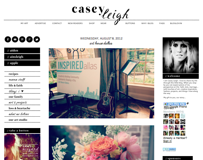
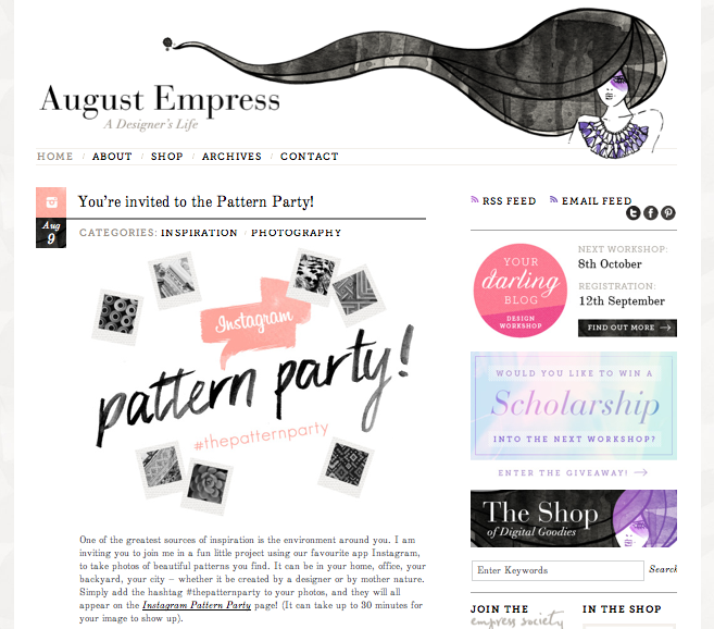
A little exercise: write down the top 3 descriptors or emotions you think of from visiting these blogs.
Clearly all of these blogs have something different about them. They feel different, they look different, they have different things going on. It would be wise to take a look at a sampling of 10 or 20 blogs you frequent (and some you don’t!) and see what those spaces evoke. Then, send your site along to 10 or 20 friends (or strangers!) and ask them to describe to you how they feel upon visiting your site and what they perceive to be true about you as the writer/curator.
My impressions of the spaces listed:
1. Casey Wiegand: Her site with its grids and lines makes the long posts palatable. It is minimalist in color while being fully maximalist at the same time (a strange contradiction, I know!). Separated from what I know to be true of Casey as a friend; I would perceive her to be somewhat scattered, endearing, honest, and down to earth.
2. Michael Hyatt: His blog is the utmost of professional. If he didn’t make himself so accessible in the comments, I would feel like it was overly corporate. However, he writes with a warm tone and makes himself known on social media–so it makes him seem less “other”. He uses no personal photos, which I think adds to the voice he is trying to cultivate but leaves me wanting more from him as a blogger. When I visit his blog, I picture myself sitting in a lecture hall rather than a personal meeting.
3. Jo Kilma: This blog is full on art. She has made it a stimulating experience from her posts, to her site design, to her sidebar elements. I imagine her to be very stylish, a voice of authority on good design, and a generous person (based on the free resources offered on her site).
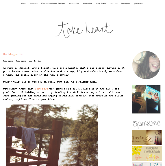
4. Danielle Burkleo: Danielle’s site design changes very frequently, which may be a way to advertise her blog design services. This both makes me come back to see the new look–while also making me a little unsure of her identity. Her voice however is consistent: always, always makes you feel like you are speaking with a really honest girlfriend…some snark included.
If you want to get Tiny Twig readers’ thoughts on how your site makes them feel/how they perceive you as the writer…leave your blog address and email address in the comments. If you’re the helpful type, visit some of the blogs and email some of the writers with your perceptions. I’ll do my best to visit several of the blogs and give my impressions, as well.

